You’ve seen it before.
A tiny swoosh. A single letter. Two overlapping circles.
And right away, you know the brand (we haven’t mentioned the brand name or slogan). However, just a clear, simple mark that somehow says it all. That’s the power of a minimalist logo. That’s the reason that most memorable logos are often the simplest ones. In fact, research shows that, on average, 75% of consumers can connect simple logos with specific brands.
These simple shapes often work better than loud, detailed logos in almost every industry. So why are big brands cutting their designs down to the basics?
And more importantly, should you do the same? That’s what we’ll explore here. You’ll learn why clean logos are working so well in 2025, see real examples, and pick up tips on how to make one yourself. Plus, you’ll get a look at what design trends are coming next.
Whether you need a design for a business logo, updating your brand, or just tired of logos that feel messy and outdated, it’s time to find out why minimalist logos matter, and when they can make the biggest impact.
So, let’s get into it.
A minimalist logo is a design that uses as little as possible to send a clear, lasting message. No extra shapes or colors. Just simple, clean, and purposeful.
In 2025, more brands are finding out that a clutter-free logo doesn’t just look nice, it actually works better. It loads quickly, resizes easily, and people recognize it right away. That’s because the brain can process images in just 13 milliseconds. The simpler the image, the faster it sticks.
Instead of trying to tell a whole story in one design, these simplistic logos focus on the core idea. They give people space to notice, feel, and remember. That’s the real secret.
This type of logo may appear simple at first glance, but it is carefully made using specific design elements. Here's a breakdown of these key elements:
Now that we’ve covered the basics of a minimalist logo, let’s look at some real examples. These brands show that sometimes, less really is more.
What’s more powerful than a fancy, complicated logo? A super simple one that’s easy to remember without any effort. That’s the magic of minimalism, and these brands prove it works. Let’s check them out:
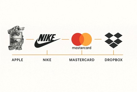
Apple
It’s just an apple with one bite taken out. No text or fancy effects, yet it’s one of the most famous logos in the world. It’s clean, bold, and instantly connects to Apple’s brand, simple tech with smart design.
The Apple logo has stayed the same since 1998, showing how timeless minimalist design can be.
Nike
That swoosh? It was drawn by hand in 1971 and cost only $35. Today, it’s a worldwide symbol of speed, energy, and success. It’s sleek, easy to recognize, and full of movement—just like the athletes Nike supports.
In some campaigns, Nike doesn’t even use the brand name—just the swoosh. That’s how strong the logo is.
Mastercard
The old logo had words and shadow effects. Now? Just two overlapping circles—one red and one yellow. That’s it. It’s bold, simple, and works well online, in apps, and in stores. The circles still represent "Mastercard" without needing to be said.
In 2019, Mastercard dropped its name from the logo entirely, following the trend of symbol-only brands.
•Dropbox
They used to have a small box icon. Now it’s a grid-style, folded shape that looks modern and clean. The new logo is simple and easy to see on all screen sizes, from phones to laptops.
Here’s something to notice: if minimalist logos have been around for so long, why are they suddenly getting so popular in 2025? Let’s find out in our next section.
In 2025, brands are choosing minimalist logos because they solve real problems in our fast, screen-filled world. Here are the main reasons why this style is more popular than ever:
Minimalist logos use simple shapes and symbols that anyone can understand, no matter where they are from. This makes them great for brands that want to reach people all over the world.
People scroll fast and don’t spend much time looking. Simple logos get noticed and remembered faster. Even logos with fewer details get remembered faster on social media than complex ones.
Clean, simple logos feel honest and calm. They send a clear message without distractions. Companies in health, finance, and tech have found that minimalist logos help customers trust them more.
Now that we know why minimalist logos are so popular in 2025, let’s talk about what they actually do for your business. These benefits go far beyond just looking clean.
A good logo doesn’t just look nice; it sticks in your mind. Minimalist logos make this easier because simple images are faster for your brain to recognize and remember.
Think about it: do you remember the Starbucks siren or the lowercase “f” of Facebook first? That’s the power of simplicity.
Minimalist logos look great everywhere, from big billboards to small phone screens. They scale perfectly without losing detail or looking blurry. This saves time, money, and hassle for use in print, online, packaging, and more.
Trends come and go, but minimalist logos last. Their simple design helps them avoid looking old or outdated after a few years. That’s why brands like Nike and Apple haven’t needed major changes in decades. In fact, a 2024 survey found that 68% of successful logo updates involved simplifying the design.
Without extra details, minimalist logos let your main message stand out clearly and quickly. Even in crowded markets, simplicity helps you stand out with confidence.
Simple logos usually cost less to print and update. You don’t need special printing or many versions. Updates are easier and cheaper.
Minimalist logos look simple, but there’s a smart plan behind every clean design. Whether you’re making a new logo or updating an old one, it’s not just about removing things—it’s about keeping only what really matters. Here’s an easy step-by-step guide to help you or your designer create a logo that’s simple, clear, and effective.
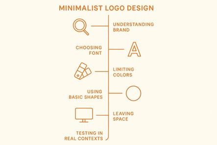
Before you start drawing or picking fonts, spend time thinking about your brand. What does it stand for? Ask yourself:
If you’re not sure how to answer these, working with a logo design company can help. They’re experts at turning your brand’s message into simple pictures without making things complicated.
Minimalist logos usually use clean fonts, like bold sans-serif (without extra lines) or classic serif (with small lines). Avoid fancy or hard-to-read fonts. The goal is to make your logo easy to read and understand quickly.
If you want something unique, a well-chosen font alone can make a strong logo just by using your brand’s name.
Keep your colors simple. Use one or two colors at most. Black and white is often the easiest and cleanest choice, but adding one bright color (like red, blue, or green) can make your logo stand out.
Also, check if your logo looks good in black and white. This is a good test to see if it’s strong and clear even without color.
Simple shapes like circles, lines, and squares might seem plain, but they are the building blocks of great logos. Start with easy shapes and then adjust them to make your logo unique.
Look at famous logos like Airbnb or Target: one uses smooth curves, and the other uses a simple dot inside a circle—but both are easy to remember.
Empty space, or “white space,” is important. It’s not wasted space—it gives your logo room to breathe and makes it feel balanced.
A logo that’s too crowded feels confusing. One with space feels clean and confident.
Make sure your logo looks good, big, and small. Try it on a website, on a hat, or on a receipt. If it still looks clear and strong everywhere, you’ve done a great job.
Also, try looking at it without colors or text. The best logos can still be recognized even without those extras.
Now that you know the basic steps to create a minimalist logo, you might wonder if doing it yourself is enough. The truth is, there’s more to a great logo than just following rules.
There are lots of DIY tools for making logos, but here’s the real deal:
A professional minimalist logo isn’t just about choosing a font or removing extra parts. It’s about knowing your customers, using smart design ideas, and creating a logo that will last a long time.
This is why working with logo design companies can help. They have the experience, research, and knowledge that you can’t get from a simple template.
So, you’ve got a clean, crisp Minimalist Logo—now what?
Well, minimal doesn’t mean boring. Professional logo design services are finding smart ways to build on top of that simplicity without messing it up. Think of it like adding flavor to a solid base; you don’t need much, just the right touch.
Here’s how brands are enhancing minimalist logos in 2025:
These aren’t about adding noise but about adding life. If you're working with experienced logo design services, they’ll know exactly how far to take it without breaking the simplicity.
This logo simplification trend isn’t going away, but it is changing. As design tools improve and people expect more from brands, logos are becoming more dynamic and flexible.
Here’s what’s coming next:
Designers are using AI to help come up with and improve logo ideas faster. But don’t worry—it still needs a human to make sure the design feels original and unique.
Instead of just a still image, logos can move a little—like when a page loads or when you hover over them. More brands are using simple animations to grab attention, especially online.
Logos are starting to change automatically depending on the screen size, app icon shape, or even dark mode settings. This kind of flexible design is becoming important, especially for mobile devices.
Even digital brands care about the environment now. Logos that use fewer colors, print with less ink, or need fewer versions are becoming popular as a way to be more eco-friendly.
People meet your brand in small sizes and in fast moments. They do not read a logo. They recognize it. When you cut extra detail and keep a clear shape, you reduce effort for your audience and raise trust. That is why the minimalist logo keeps gaining ground in 2025.
If you are planning your next logo, start with strategy, test at tiny sizes, and write rules that keep the shape steady across every channel. Borrow ideas from brands that have already simplified the right way, and then make choices that fit your voice. You can draft options yourself or work with the right partner to speed up testing and rollout.
The best part is this. A clean mark does not limit you. It sets a strong base for motion, animation, and adaptive systems. Keep it simple, keep it clear, and your logo will work hard for you for years.
Looking for more information? Call us at +1 (855) 521-5040 for quick support!


Have a project in mind? Reach out to us, and we’ll help turn your ideas into stunning illustrations.
Tell us what you need, and we’ll create a custom illustration just for you. Reach out today and let's get started!

Copyright © 2026 360 Illustration House | All rights reserved. Terms And Conditions | Privacy Policy | Refund Policy
